
one template -
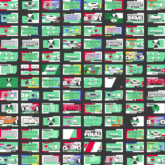
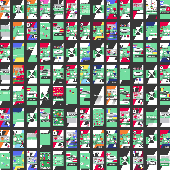
over 200 videos
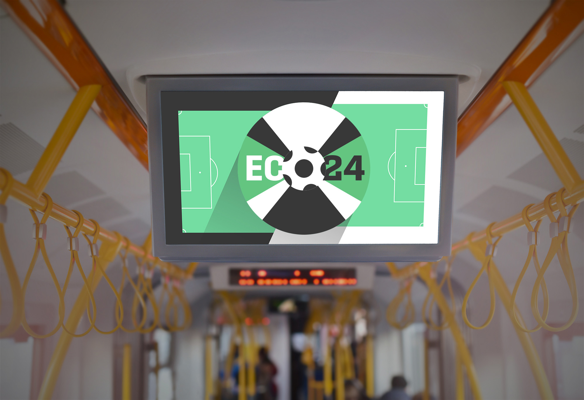
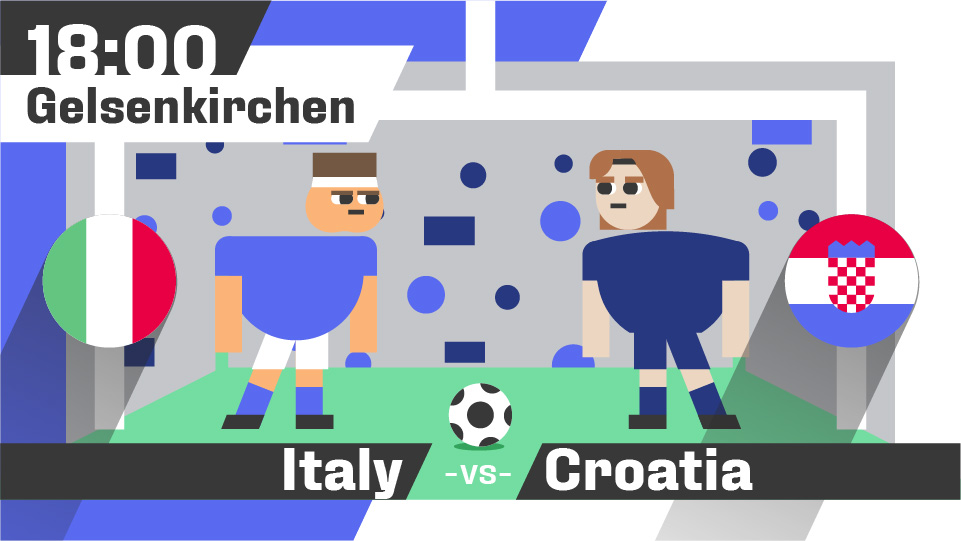
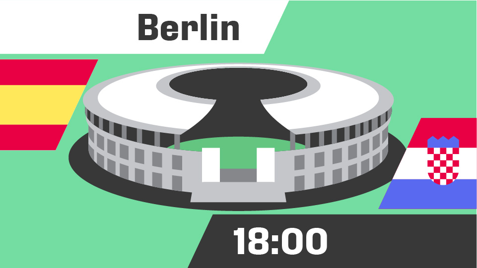
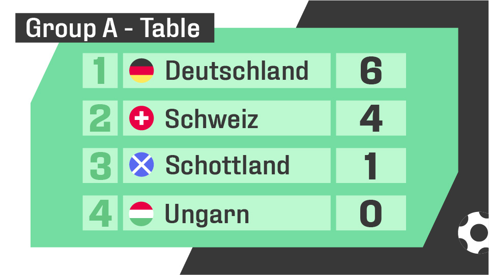
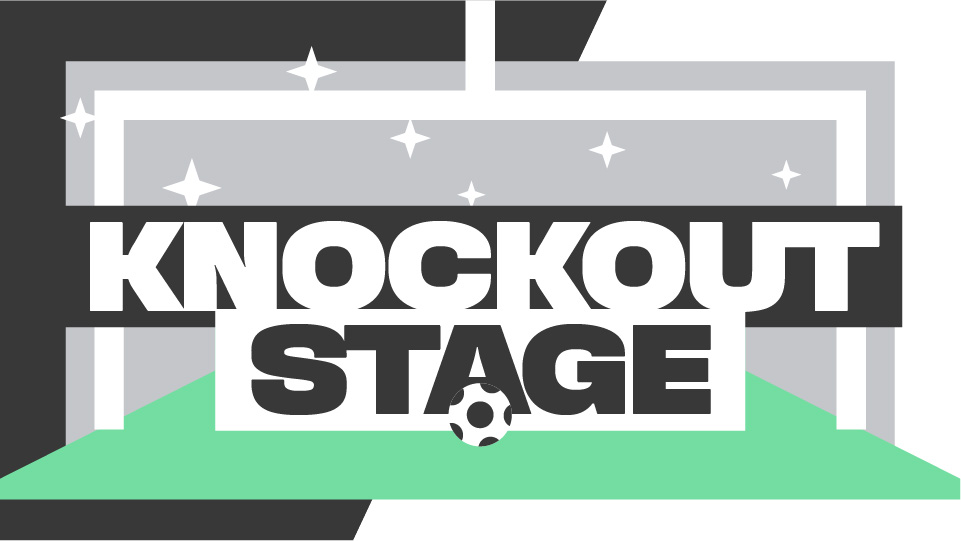
I was always wondering if we could display sport results and previews in a more creative way. So for the European Cup 2024 I created numerous animations all out of just one file. These animations where displayed throughout public transport, gas stations, post offices and digital screens.
FLAGS simplified


KITS home & away


KITS color distribution

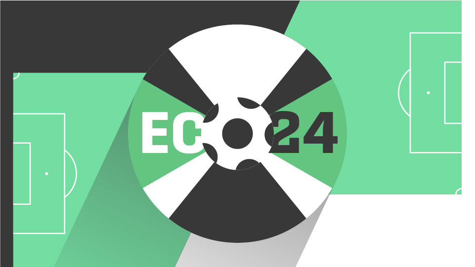
the most important aspect of
this project was simplicity
it was imperative to have as few colors as possible and to keep the style fun and simple. to achieve this i reduced the flag colors to just
6 and the kit colors to just 15. this also meant i could not apply any details on the kits, such as the iconic checkerboard for croatia.
OVERALL design

CHARACTER design


contrast, geometry, color
For the style of the characters i went for something high contrast, simple and fun. I used a wider palette of skin and hair tones. the standard design is serious looking and was used for the previews and the early result animations. for the knockout phase of the tournament i created a "win-character" and a "loose-character" of each team (twice, once for the home-kit and once for the away-kit).
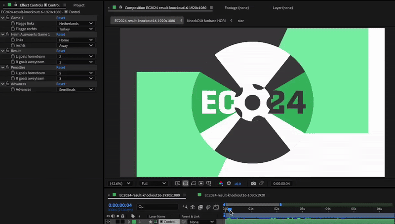
HOW it works
ANIMATION examples